https://learn.microsoft.com/ko-kr/training/paths/get-started-fabric/
Microsoft Fabric 시작 - Training
Microsoft Fabric 학습 모듈, 패브릭 학습 모듈, 학습 패브릭, 패브릭 학습, Microsoft Fabric 학습, Microsoft Fabric 학습 경로, Microsoft Fabric 시작
learn.microsoft.com
I'm interested in Data Analysis and viusalization. Nowadays I study Fabric that gives the end-to-end analysis service.
In this learning path, There are 11 modules to finish.
<Get started with Microsoft Fabric>
1. Introduction end-to-end analysis using Microsoft Fabric
2. Get start with LakeHouse in Microsoft Fabric
3. Use Apache Spark in Microsoft Fabric
4. Work with Delta Lake tables in Microsoft Fabric
5. Use Data Factory Pipeline in Microsoft Fabric
6. Ingest Data with dataflow Gen2 in Microsoft Fabric
7. Get start with Data Warehous in Microsoft Fabric
8. Get start with real-time Intelligence in Microsoft Fabric
9. Get start with Data Science in Microsoft Fabric
10. Get start with Data Activator in Microsoft Fabric
11. Administer Microsoft Fabric
In this post, I'll review about only 2, 3 modules.
1. Introduction end-to-end analysis using Microsoft Fabric
Explore end-to-end analytics with Microsoft Fabric
explore OneLake
Fabric's experiences
Synapse Data Engineering
Synapse Data Warehouse
Synapse Data Science
Synapse Real-Time intelligence
Data Factory
Power BI
Explore security and governance
Data teams and Microsoft Fabric
Enable and use Microsoft Fabric
In this module, you can learn about these things. I felt that these things are so abstract and difficult.
So, I recommend that learning by doing exercise in each module. This method is much easier than read all of articles.
2. Get start with LakeHouse in Microsoft Fabric
Explore the Microsoft Fabric Lakehouse
Work with Microsoft Fabric Lakehouses
Explore and transform data in a lakehouse
Exercise - create and ingest data with a Microsoft Fabric Lakehouse

If you have no subscription for Microsoft Fabric, you can use Fabric by trial for 60 days
And then, while you create a workspace
1.click the "Advanced"
2. set the License mode "trial".

In exercise, you upload the scv file.
After checking uploaded file,

If you face the error like "typeerror", "IndexOf...", the reason is caused by browser.
You can check the error information the following image.

After I change the browser from Chrome to Microsoft Edge, the problem was solved

By using SQL query, you can see the table which contains what you want.

Also, in visual query, you can choose columns and see grouped rows easily.

In the report page, you can create the visualization resources easily.
like graph, table and so on..
3. Use Apache Spark in Microsoft Fabric
What is Apache Spark?
It is open source parallel processing framework for large-scale data processing and analytics.
I'll review the exercise only. If you have another question and want to see more information, please visit the website on the top of this posting.
Analyze data with Apache Spark
1. Create a workspace
2. Create a lakehouse and upload files

click "new" and select "Lakehouse"

After a minute, a new Lakehouse will be created.

download and extract the data files on the page.
And upload 3 csv files.
3. Create a notebook

and then, create a notebook while viewing the contents of the orders folder.
click the 3 dot shape button -> Open notebook -> new notebook

On that page, by M button, you can check the text which is rendered.


I changed the text in cell. I can check the change instantly.
4. Load data into a dataframe

load data "Spark"

and then, a new cell is created.

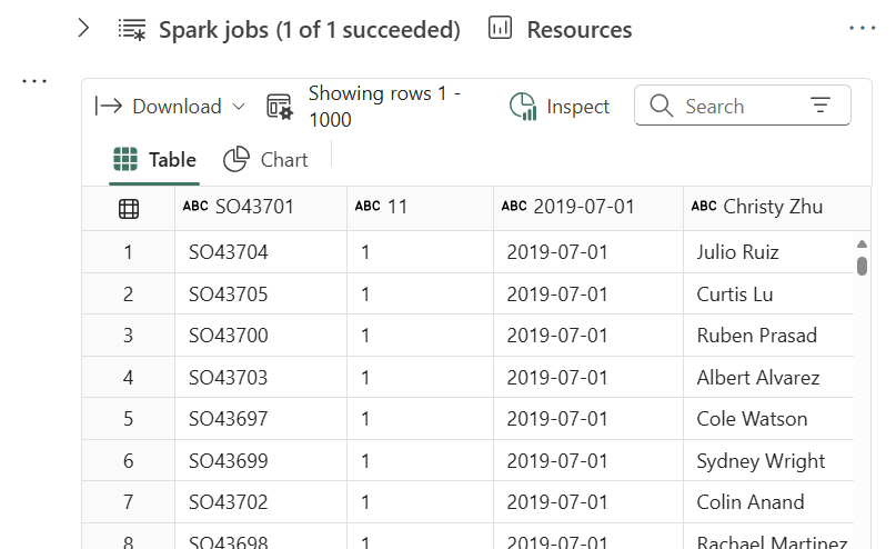
After running the code, the loaded table is appeared.

If you change the header option to false, you can see this table.
Name of each column is composed of letter C and number.


Modify the code to define a schema.
And now, it is easier to review the table.

The dataframe can contain not only a file but also the files in folder.
After modifying the code, the dataframe contains 2019, 2020, 2021 csv files.
5. Explore data in a dataframe


Using select method, you can modify the code like this.
this code views the customers who have purchased the Road-250 Red, 52 item.
6. Aggregate and group data in a dataframe

In this code, the groupBy method grouped the rows by product("Item").
and apply sum aggregate function to "sum(Quantity)" column.

In that code, it uses an alias method that assigns a column name.
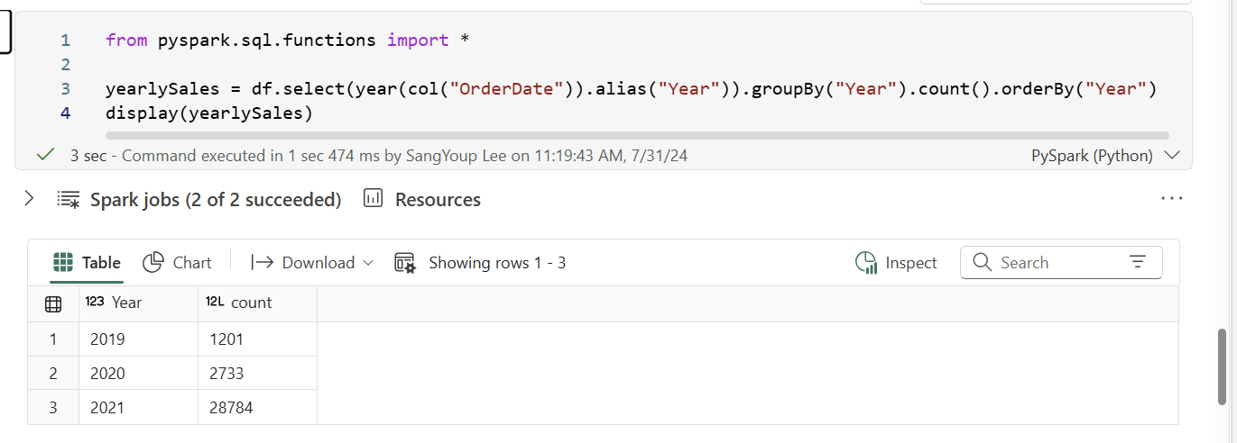
The groupBy method grouped the rows by year
And applied count aggregate function.
the orderBy method sorts the resulting dataframe. In this situation, It sorted the year by ascending order.
7. Use Spark to transform data files.

In this code,
Create year and month colums : withColumn method(column name, value)
create the new FirstName and LastName fields : withColumn method, and split the name based on the blank.
Filter and reorder columns
Display the first five orders : set the limit
8. Save the transformed data


new file is created!

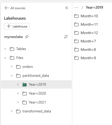
9. Save data in partitioned files


You can check out the partitioned data by year and month.

10. Work with tables and SQL
create a table


After refreshing, you can see the table "salesorders".
and click "..." button -> load data -> Spark
you can see the code like following picture.

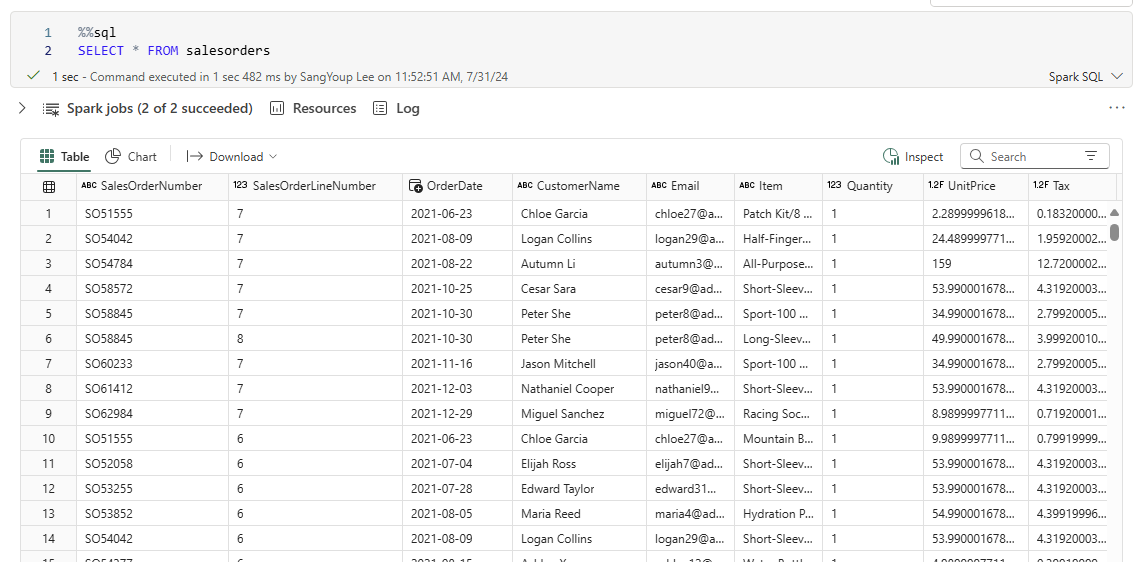
Run SQL code in a cell

%%sql -> it called magic. It indicates that the Spark SQL language should be used instead of PySpark.
This SQL code references the salesorders table which is created previously.
11. Visualize data with Spark
View results as a chart

And then, select "chart"

After setting the parameters, you can see the chart of item.
Get started with matplotlib


uisng matplotlib library, create the chart easily. (especially pyplot object)

In this code, you can create a figure explictly.
figure means that the method defines the size of canvas.
the below code indicates the chart when you define the figure explicitly.


A figure can contain multiple subcharts by using axis.
In this figure, 1 row and 2 columns.
Use the seaborn library

the seaborn library is easier to use than matplotlib.
Because it is built to abstract the complexity of matplotlib.

set the visual theme

draw a line chart to view the yearly revenue.
I'll review the next module in other post!